Joaquín Cuesta Fuentes
UX | UI Design
Back to Main
Portfolio
Asteroid Hunters: Isotype Design
What is this project?
This was a graphic design project that tasked us to create several factions for a fictional game called Asteroid Hunters, and then design logos that would suit each faction’s character and transmit their identity. Being very enthusiastic about the concept, I decided to build an interactive presentation using Adobe InDesign, which I was also learning at the time, to showcase each of the designs and their visual process. I decided to go with a retro look for the design, echoing the aesthetic of “cassette futurism” and adopting varying levels of old-school marketing design for the different factions depending on the specific aesthetics evoked.
Presentation & Link
The following document shows some highlights of the work, but you can also access the interactive presentation through the link below.
Main

How was it made?
Here is the process followed to elaborate this Research Report
Game Logo Proposals
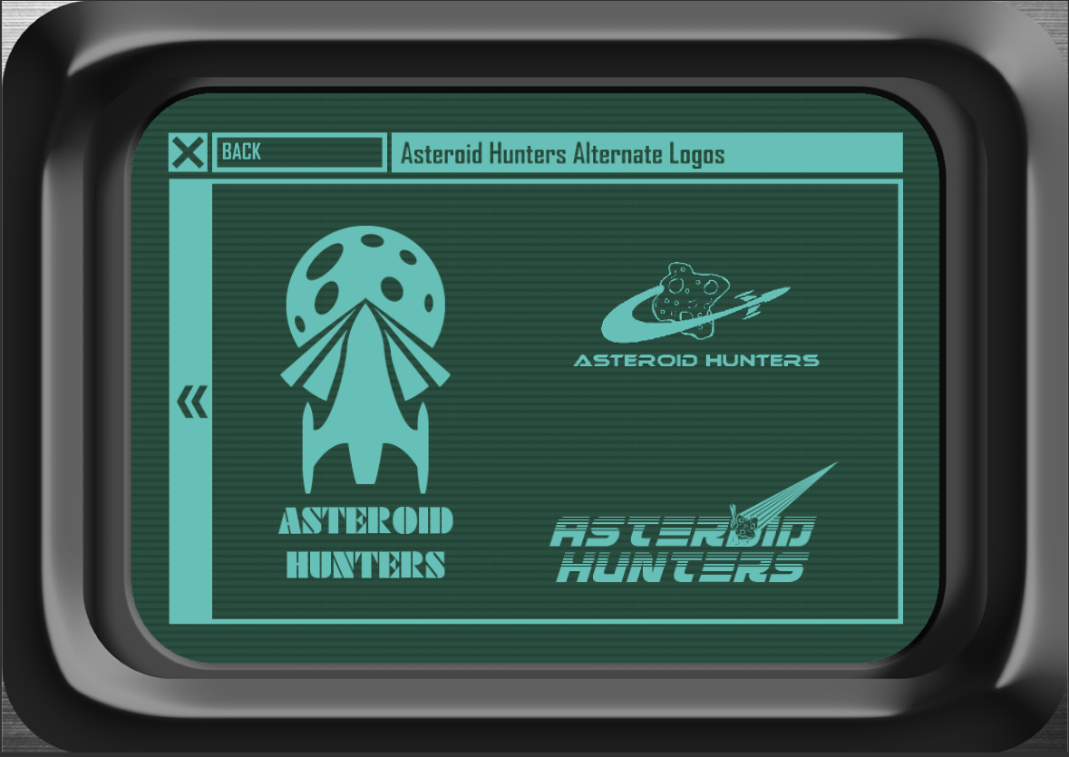
While the logo that appears in the main screen was the logo designed by the whole class, I started by creating personal proposals for the game’s logo as a way of
Developing the Factions
This was more of a creative writing exercise, but I used common elements of retro science fiction (interstellar corporations, planet alliances...) and tried to build storytelling between the factions.
Reference Searching
Based on each faction’s concept I did background research on visual languages that could be associated with it. For instance, for a faction called the Alliance of Interstellar Socialist Planets (a name that reflected the penchant of soviet institution for very literal and explicit acronym names) I researched soviet emblems and logos for agencies in order to create a futurist version of that design language.
Building Symbol Language
For each individual faction, I built a symbol language for the logo. For instance, for the faction called Vanguard (which is a defence contractor), there is a combination of the V from the name, arrows that point forward to evoke a forward march, and the visual of a shield wall with spears pointing forward.
Develop the Logos
From the combination of symbols of each logo, I developed the symbols within the visual language determined for each faction.
Joaquín Cuesta Fuentes
Joaquín Cuesta Fuentes
UX | UI Design
Back to Main
Portfolio
Asteroid Hunters: Isotype Design
What is this project?
This was a graphic design project that tasked us to create several factions for a fictional game called Asteroid Hunters, with a general game logo developed collectively by the whole class as an experimentation with the design tools; and then individually design isotypes or combination marks that would suit each faction’s character and transmit their identity. Being very enthusiastic about the concept, I decided to build an interactive presentation using Adobe InDesign, which I was also learning at the time, to showcase each of the designs and their visual process. I decided to go with a retro look for the design, echoing the aesthetic of “cassette futurism” and adopting varying levels of old-school marketing design for the different factions depending on the specific aesthetics evoked.
Showcase and Link to InDesign Website
The following document shows some highlights of the work, but you can also access the interactive presentation through the link below.
Main

How was it made?
Here is the process followed for this project
Game Logo Proposals
While the logo that appears in the main screen was the logo designed by the whole class, I started by creating personal proposals for the game’s logo as a way of finding an aesthetic that I’d try to present the project in.
Developing the Factions
This was more of a creative writing exercise, but I used common elements of retro science fiction (interstellar corporations, planet alliances...) and tried to build storytelling between the factions.
Reference Searching
Based on each faction’s concept I did background research on visual languages that could be associated with it. For instance, for a faction called the Alliance of Interstellar Socialist Planets (a name that reflected the penchant of soviet institution for very literal and explicit acronym names) I researched soviet emblems and logos for agencies in order to create a futurist version of that design language.
Building Symbol Language
For each individual faction, I built a symbol language for the logo. For instance, for the faction called Vanguard (which is a defence contractor), there is a combination of the V from the name, arrows that point forward to evoke a forward march, and the visual of a shield wall with spears pointing forward.
Developing the Logos
From the combination of symbols of each logo, I developed the symbols within the visual language determined for each faction.
Joaquín Cuesta Fuentes

